My Roles: UX Researcher, Designer
Timeline: 3.5 Months
Timeline: 3.5 Months
HYDRACY PAGE REDESIGN
What is the Hydracy brand?The Hydracy brand is centered around health and wellness; specifically focusing on hydration and maintaining healthy habits. The company offers an array of water bottles, health information, and powdered supplements. The site is designed to display all of their products while conveying a welcoming introduction into a lifestyle that can seem intimidating. However, the compilation of images and text seem, at points, unnecessarily repetitive and insincere. On this page I will display the original site and my updated take on it's design.
ChallengeAfter reviewing the site I noticed that the lack of authentic photos of the products made the company seem illegitimate. This lead me to do some research into the site's web presence and reviews from users. From the research I found multiple Amazon pages and an Instagram page for the company. The site was real but lacked authenticity. The product pages also had repetitive information and unnecessary text which increased navigation time.
The overall challenge was to simplify design, decrease navigation times, and use real product photos. |
My Toolbox/Process
Design Principles
When looking at the website I felt it needed a small lift in appearance to make it more modern to match the competitors from my research. I comprised design principles to help form a design plan.
|
Minimize: Reduce clutter, Eliminate repetitive text, Reduce page scroll time. Increase Authenticity: Use photos that better represent the products, eliminate text that provides poor product marketing. Modernize: Use slimmer design, Use different fonts, Use fresher colors. |
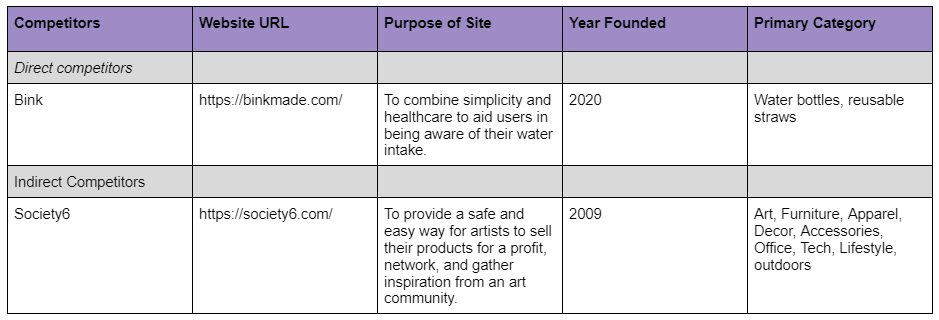
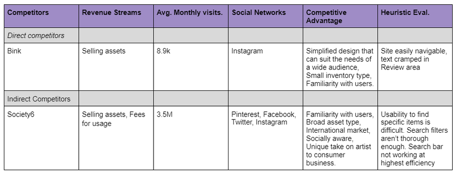
Competitive Analysis
Goals
- To get a better understanding of the market
- To see what works and what doesn’t
- To improve design process
- To know strengths and weaknesses of the competition
Requirements
|
Cart
- Cart icon Log in - User icon Product selection - Color selection, Product suggestions, Product image, Size selection, Availability. |
Add to cart
- Add to cart button, option to add more items to order Customer reviews -Stars that indicate ratings Product info - Product dimensions, Product materials, FAQ's |
Product Image/Information
My thought process-Product Image/Information
|
|
|
|
Declutter-
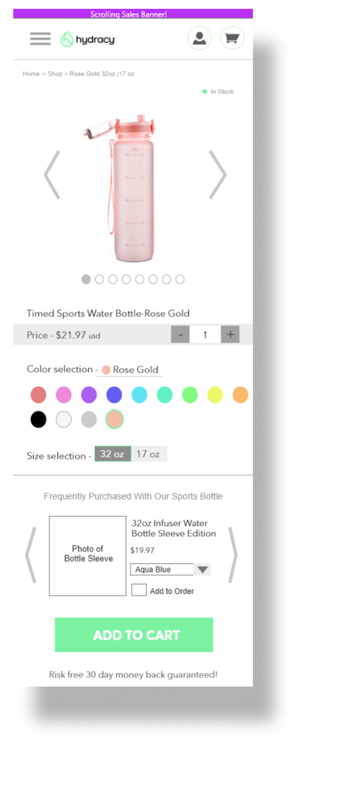
I felt the text/images on the page was crammed and caused a lot of chaos when trying to pick out helpful information. To fix this I minimized the text and created more of a balance between the text and white space.
Simplify-
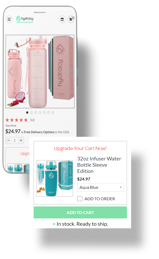
I wanted to modernize the look a bit so I changed the font and added subtle design elements. The original design was very large and in your face, similar to old infomercials. I shrunk some of the elements so it would be easier on the eyes of the viewer. I also wanted the user to be able to see if an item is in stock prior to going to the cart.
Streamline-
In the original design the site offers you the option of adding on an additional item to their purchase. However, there are multiple forms of each product varying in color, size, and accessories. To fix this I provided the option to click through related items in the Frequently Purchased Together section (previously known as the Upgrade section.)
Aid Navigation-
To help users be aware of clicked paths I utilized the Breadcrumb technique to show viewers previous viewed pages and provide the ability to easily return to them.
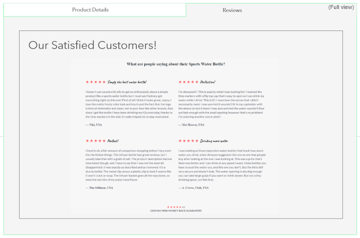
Product dynamics, reviews, + helpful information
Original - Mobile
Made in Adobe XD
Updated - Mobile full page
Made in Adobe XD
My thought process
|
|
|
|
Condense-
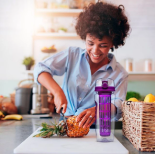
The original design had a lot of repetitive information which could cause mistrust amongst users. I eliminated the unnecessary text and focused on the main points that, at a quick glance, would convey as much information as possible. Organize- The original page was really long full of content that the user had to scroll through. I organized it all into a dropdown menu so the user could focus on the information important to their current visit. Images- The images in the original page seems inauthentic. The models in the photos would seem as if they were holding the products but it was obvious that they were regular stock photos with the product photoshopped in. In my redesign, I used a photo with a off-brand water bottle and inserted a note in my report suggesting that the real photos of the products be used on the site. |
*Examples of the inauthentic photos
|
Reception
I received great feedback on the prototype. Standout remarks were, "The design was very clean and easy to understand. It would have been nice to have more of the assets flushed out for the prototype. Great use of information architecture." Overall, I was pleased with how the end product turned out and look forward to potentially improving it in the future.
Limitations and Future work
This was a solo project so I had to rely heavily on my own market/company research; which could potentially minimize the design perspective. I didn't have real photos of models holding the product so I had to add notes to explain that the stock photos used were stand-ins for the actual product. I also didn't have time to make a full hi-fi prototype and flesh out all of the page assets. In the future I would work with a team of diverse talents and purchase the product ahead of time to take authentic photos. I'd also dedicate more time to the prototyping phase.
Prototype Links
*Edit: Since the redesign of this page the company has added one photo of a model using one of the company's products.

